Exploring the Role of Animation in Television News

with the Reinventing Local TV News Project, SmithGeiger, and the Stanton Foundation

Anna Campbell | Viz Tech II | Spring 2021

Team members at Northeastern University’s School of Journalism are wrapping up the second phase of a project called Reinventing Local TV News (RLTVN) this spring. Through industry partnerships with television stations WLS-Chicago and WCVB-Boston, as well as with audience analytics firm SmithGeiger, we are learning what it takes to build the newsroom of the future -- in a time when information is plentiful, but adequate tools to make sense of it are not. Last year, the team made a striking discovery about the potential of animation and graphics to substantially expand a story's clarity and impact. This year, we conducted an extensive survey of news consumers across Boston and Chicago. Through the survey we learned about attitudes held by various demographics about news today, as well as solicited responses to A-B testing of short video news segments produced with and without additional animation and graphics.

"News Drivers" by Demographic

People have diverse reasons for tuning into the news, and expectations for what makes a meaningful broadcast vary. Mouse over the points on the radar chart to discover what matters most to each age demographic.

Female demographics

Male demographics

Younger demographics

Middle-aged demographics

Many stations are interested in attracting a younger audience. In addition to investing in a robust online presence, young people don't generally cite innovative graphics or a contemporary aesthetic as a reason to tune into the news.
Responses to Animated Story Version

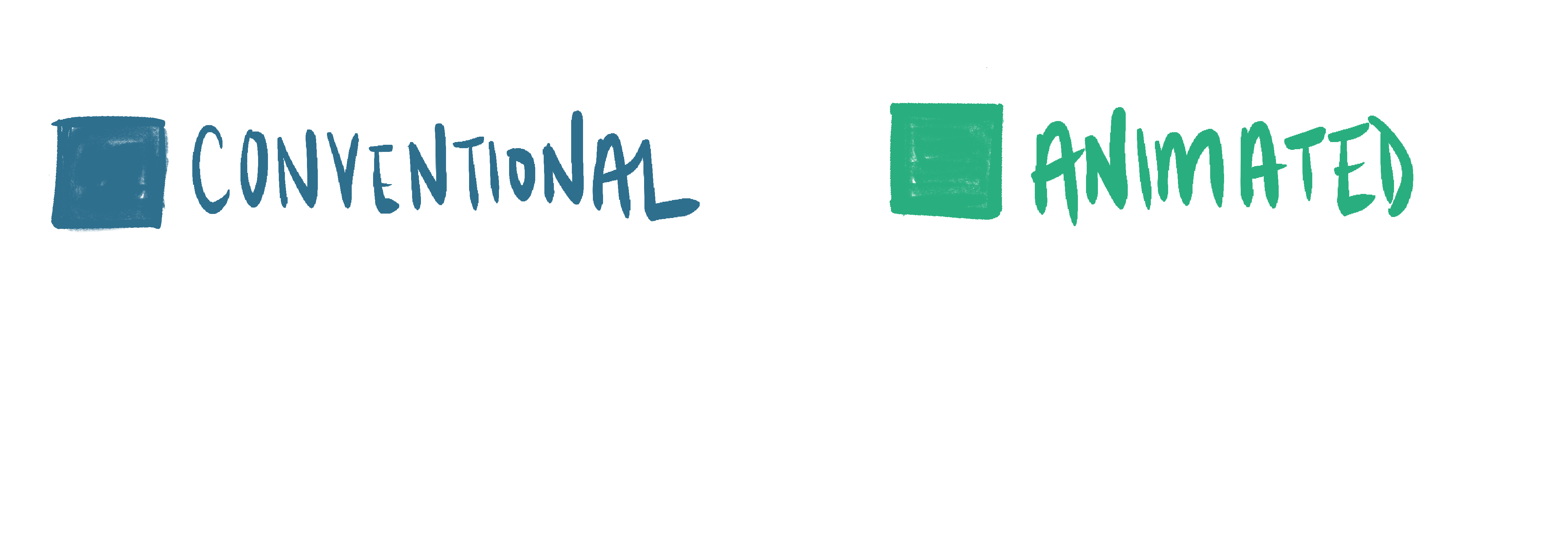
Adding animation to the videos enhanced audience perceptions of TV news in general, as shown in this radial bar chart. While the change wasn't much, in many cases it was the tiebreaker that bumped these "positive descriptors" over the 50% mark. However, on a per-video basis, the results of animation and graphics are much more noticeable. Take a look at how adding animation enhanced viewers' experience and reactions in the chart below.

Descriptors of Animated Videos vs. Conventional

Open-Ended Responses

Keywords Used to Describe Animated Stories

In addition to the A/B screening tests and multiple choice demographic survey questions, our survey included open-ended questions. The vast majority of participants who stated that they prefered the animated version over its conventional counterpart. When asked to elaborate on why, these were the most prevalent keywords that came up.

Thanks to Nadieh Bremmer, Brice Pierre and Jason Davies for the inspiration and starting templates for the radar chart/spiderplot, radial bar chart, and word cloud placement alogrithm, respectively.